
Wedding Dilemma's - How to choose a colour scheme
Introducing Tara Smith from InTara Design………
A little Hello from me!! I am Tara of InTaraDesign and i’m a qualified Interior Designer who loves colour! Whilst conversing alongside Eleanor from Hibiscus and Hodge we both noticed a common trend with the clients we were working with. A common question from them was frequently popping up ‘’How do I choose a colour scheme?’’ Now this may seem really simple…. ‘’You just pick the colours you like…. Right?’’ ‘’Wrong!’’ There is so much more to think about than simply choosing a colour you like, of course there’s no point choosing a colour you don’t like but when you’re faced with so many different colours that you do like how do you choose a colour scheme? If you just choose all the colours you liked would it just be a mess of colour that doesn’t really work? So as a result I have come up with 3 simple steps or rather techniques that you can use to help you choose your colour scheme.

Angel , Tara, Dick & Jordan at Chateau De la Motte-Husson.
Technique 1
I suppose the most traditional way to choose colours that go together would be to take things right back to basics and start looking at the colour wheel. You can see that the colour wheel is made from the 3 primary colours red, yellow and blue, these are colours that cannot be made by mixing they occur on their own however can be mixed to form your secondary and tertiary colours. Your secondary colours are a mix of 2 primary colours and your tertiary colours sit either side of those which form shades or variants of those colours.

So how do you use this to create your colour scheme? Well you can follow these principles:
Complimentary colours: colours which sit directly opposite on the wheel, many think that they will clash however if used well they will complement each other to great effect.
Analogous colours: a common trick when choosing a colour scheme is to select one main colour then use colours that sit either side of it for accents, this is to stop the main colour of the room from becoming too overwhelming.
Triadic colours: a mix of 3 colours which sit within a triangular formation on the colour wheel.
Technique 2
Now you could also look at your colours from a different perspective, a psychological one, what feelings, emotions or mood do you want to convey from your colour scheme? Traditionally colours have each had their own meanings through their historical influence and what effect they can have on us, now that doesn’t mean you should avoid a particular colour as negative effects can usually be cancelled out by using the positive effects of another colour.

images used from Pinterest
For example the traditional thoughts behind pink is that it conveys a feeling of love and restfulness however it can also be associated as sickly sweet, these effects can be balanced out by using greys. Equally if you were to choose greys and blacks generally there is a bad reputation with it absorbing other colours however it can be used to reduce negative impacts of other colours. Purple is a colour that was mainly associated with royalty due to the high cost of the pigments, following on from that many well established companies use this colour for their branding, think Liberty London. Green is a colour that has some real positive impacts as it is associated with nature and often has calming and restorative properties. So when choosing colours have a think about how you would like your wedding day to feel and how these relate to particular colour choices.
Technique 3
One of my all-time favourite ways to create colour schemes is by taking inspiration from what’s around us you may have a favourite place that you love going to that makes you feel a certain way when you go there or visit there, or you may have a ton of inspiration images saved to Pinterest but just don’t know how you can transfer those images into your scheme. Well I have good news for you!! You can use all of those images to find your perfect colour scheme
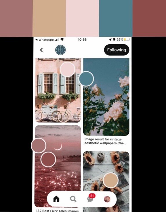
Here I have produced a colour scheme based upon the clients inspiration images that they have saved on Pinterest. The reason I really like to use this technique to choose colours is it may throw up something ‘unconventional’ or even colours you never would have dreamed using together. You can also see if there is a common theme running through the images that you have chosen for example in image one you can see there is a really airy and light feel to the colours and images. With lots of shades of the same colours with blue to complement. Typically relating back to the colour wheel this colour scheme would be following analogous colour scheme as one main colour has been chosen with variant shades.

You could also use this technique if you wanted your wedding to be inspired by season in which you’re holding your wedding, you may have a board of images relating to summer or autumn which you could then pull the colours from in the same manor. To me this colour scheme represents an autumnal feel as you often see these colours represented through nature in the Autumn months, however from a psychological perspective the colours complement each other well as you have the calming aspects of the greens and yet the passion and optimism conveyed by the oranges and reds. Looking back at the colour will these colours would represent a complementary colour scheme as the main colours, green and reds sit opposite each other on the colour wheel.
There are many apps and tools online that you can use to help you nail your colour scheme. One of my favourite is using adobe Kuler to upload an image and nail your colour scheme.
If you’re struggling with choosing your colours for your wedding - have a go at playing with these techniques and let us know how you get on.
Thanks for reading
Tara & Eleanor